Table of Contents
Basics for creating a smartform
HTML
HTML stands for Hyper Text Markup Language and is the standard markup language for creating websites. In combination with other languages like Cascading Style Sheets (CSS) and JavaScript HTML is the basis of web-development. Therefor HTML is used to determine the structure of websites. HTML is therefor not a programming but a markup language and is thus easy to learn.
In the following some useful HTML elements for smartform building are presented. A detailed documentation as well as various tutorials can be found under W3Schools.
CSS
CSS or Cascading Style Sheets are used to affect the design or presentation of websites created with HTML. CSS is designed to seperate structure and presentation of a website. Normally the styles are defined in seperate .css files.
The User experience besides the functionality heavily influenced by a appealing design. The visual editing with CSS is an important part of the smartform design.
A detailed documentation as well as various tutorials can be found under W3Schools.
JavaScript
Javascript is a client-side programming language, which is executed in the browser. While HTML and CSS represent the website's static content, user interaction can be reacted to with Javascript. Furthermore functionalities like calculation or auto completes can be implemented.
A detailed documentation as well as various tutorials can be found under W3Schools.
Planning
Before implementing a smartform, its structure, design and functionalities should be planned carefully. Smarforms provide a process with necessary information. A good starting point for planning is which information is needed
at which point in the process sequence. These are functional requirements.
When the functional requirements are clear, they hav to be implemented in a user friendly design. It should be noted which users have to work with the smartform. An appealing user interface really makes working with the smartfrom easier. However the functionalities should always come before the aestethics.
When planning a smartform using a paper prototype or mockups can be useful. Drafts can be discussed with endusers and can also be modified. For creating a mockup or a prototype there are many different helpful tools like Balsamiq Mockup or Sketch.
Using Frameworks
 To make web development more comfortable, various HTML, CSS and JavaScript frameworks have been developed. We regularly use Bootstrap when developing smartforms. Bootstrap offers predefined CSS classes, that enable the development of an appealing and responsive smartform design. How Bootstrap is integrated into the form is shown in our detailed smartform-example. Besides Bootstrap libraries like Polymer gain in popularity.
Besides Bootstrap and Polymer the Javascript library jQuery is an important component of smartform development. The extensive API offers various functions, like to catch user input.
For very complex smartform with complicated calculations or requests the framework AngularJS, developed by Google, is very useful.
Of course it is possible to integrate own frameworks either via the HTML code of the smartform of via the custom.js file (explained in the smartform-example).

An Appropriate Editor
 A Smartform can be create in a simple text editor. However editors, that specify in programming, have a lot of advantages, like line indentation, code highlighting or autocompletes.
Popular editors are e.g. Notepad++, Brackets and Sublime Text.
Create a form
For creating a form an opening <form> and a closing </form> - tag are required. These two tags mark the beginning and the end of the document. The content to be displayed is located between these two tags.
<form>
</form>
Class and name for the form
A form needs a class and a name. Those are defined within the opening <form> - tags.
<form class="classnname" name="formname">
</form>
Make form visible for all TIM users
With the attribute security=“all” any TIM-User is authorized to view this form.
<form class="classname" name="formname" security="all">
</form>
Integrate Javascript
The Javascript file corresponding to HTML is located in the JBoss in the register:
.....server\default\deploy\loom.ear\loom-portal.war\custom\
In the folder, which belongs to the required client, is a file with the name custom.js. This is a Javascript file, which is automatically integrated into the HTML form and thus is usable for the smartform. If functions are necessary for the form Javascript, those can be phrased in the file.
The attribute initMethod=“” specifies which JavaScript function runs by loading the smartform.
<form class="classname" name="formname" security="all" initMethod="FUNCTION WHICH RUNS BY LOADING THE SMARTFORM">
</form>
The attribute validationMethod=“” specifies which JavaScript function runs before saving the smartform. A useful application would be for example a required field check.
<form class="classname" name="formname" security="all" validationMethod="FUNCTION WHICH IS DONE BEFORE SAVING">
</form>
The validationMethod must reply either “true” or “false”. With “true” it is stored , with “false” it is not stored. Here is an illustrative example:
gadget.functions.initValidation=function(){
       if(INSERT CONDITION){
	  // do something
          alert("data were stored!");
	  return true;
       }
       else{
	  // do something
	  alert("Storing not possible!");
	  return false;
       }
}
Create table
The opening table tag indicates the beginning of a table. Within the subsequent colgroup the width for each column is specified. In this case, a table with 3 columns, 100 pixel of width each, shall be created.
The tr tag is the starting point for a new row within a table, while the td tag begins a new column.
Within the td tag it is exactly defined in which row and column you are and the desired content can be entered here.
<table>
  <colgroup>
    <col width="100px"/>
    <col width="100px" />
    <col width="100px" />
  </colgroup>
  <tr>
    <td>column1 row1</td>
    <td>column2 row1</td>
    <td>column3 row1</td>
  </tr>
  <tr>
    <td>column1 row2</td>
    <td>column2 row2</td>
    <td>column3 row2</td>
  </tr>
  <tr>
    <td>column1 row3</td>
    <td>column2 row3</td>
    <td>column3 row3</td>
  </tr>
</table>
Integrate Image (Logo)
To integrate an image the tag img is required. The attribute src=“..” (the path to the desired image is given here) and the attribute alt=“..” (this is displayed when the image can not be loaded) has to be given to this. In this example the image should be located in the first column. Because the image would be too big, it can be scaled down by the additional attribute width. This defines the width of the image in pixel.
<table>
  <colgroup>
    <col width="100px"/>
    <col width="100px" />
    <col width="100px" />
  </colgroup>
  <tr>
    <td><img src="tim_800.png" width="100" alt="logo"></td>
    <td>column2</td>
    <td>column3</td>
  </tr>
  <tr>
    <td>column1</td>
    <td>column2</td>
    <td>column3</td>
  </tr>
  <tr>
   <td>column1</td>
   <td>column2</td>
   <td>column3</td>
  </tr>
</table>
Selection box (Radiobuttons)
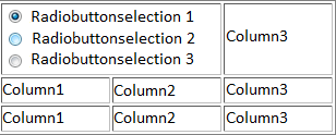
Radiobuttons are selection boxes that are always grouped together. Only one choice can be made from this group. For this the type 'radio' is assigned to the “in-itself-closing” <input> - element. To consolidate multiple radiobuttons to one group, the same 'name'-attribute must be assigned to it. If a radiobutton is already checked when opening the smartform, the attribute 'checked=“checked' must be assigned to it. PLEASE NOTE! This attribute can only have one radiobutton for each radiobutton group. For all <input> - elements the process variables are set on 'id', only for radiobuttons the process variable is set on the 'name' attribute. The attribute colspan=“2” connects a table cell with the following table cell (to the right).
If the selection of a radiobutton is also possible by clicking on the associated label, the label must be enclosed by an opening <label> - and a closing </label> - tag. This is addressed with the attribute 'for=”“' via the 'id' of the respective <input>-elements. With a <br /> - element (break) a new line is generated.
<table>
  <colgroup>
    <col width="100px"/>
    <col width="100px" />
    <col width="100px" />
  </colgroup>
  <tr>
    <td colspan=2>
      <input type="radio" name="radiobuttongroup" value="1" id="radio_1"  checked="checked" /> <label for="radio_1">Radiobuttonselection 1</label><br/>
      <input type="radio" name="radiobuttongroup" value="2" id="radio_2"/> <label for="radio_2">Radiobuttonselection 2</label><br/>
      <input type="radio" name="radiobuttongroup" value="3" id="radio_3"/> <label for="radio_3">Radiobuttonselection 3</label>
    </td>
    <td>column3</td>
  </tr>
  <tr>
    <td>column1</td>
    <td>column2</td>
    <td>column3</td>
  </tr>
  <tr>
    <td>column1</td>
    <td>column2</td>
    <td>column3</td>
  </tr>
</table>
Selection box (Checkboxes)
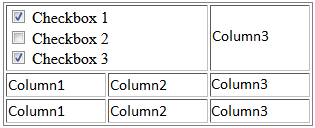 Checkboxes are also selection boxes, but can be clicked individually and independently. Otherwise, the same rules apply as those for <radio> buttons.
<table>
  <colgroup>
    <col width="100px"/>
    <col width="100px" />
    <col width="100px" />
  </colgroup>
  <tr>
    <td colspan=2>
      <input type="checkbox" name="check1" id="check1" value="true"/> <label for="check1">Checkbox 1</label><br/>
      <input type="checkbox" name="check2" id="check2" value="true"/> <label for="check2">Checkbox 2</label><br/>
      <input type="checkbox" name="check3" id="check3" value="true"/> <label for="check3">Checkbox 3</label>
    </td>
    <td>column3</td>
  </tr>
  <tr>
    <td>column1</td>
    <td>column2</td>
    <td>column3</td>
  </tr>
  <tr>
    <td>column1</td>
    <td>column2</td>
    <td>column3</td>
  </tr>
</table>
Choice box (Selectbox)
 For creating a selectbox, an opening <select> and a closing </select> - tag are necessary. To add options for selection to this, any number of options can be added between the <select> - tags. Every option needs the attribute 'value=”“', whose content can be different to the text between the <option> - tags and is not displayed. With the 'value=”“' - attribute process variables are set and queried in TIM.
<table>
  <colgroup>
    <col width="100px"/>
    <col width="100px" />
    <col width="100px" />
  </colgroup>
  <tr>
    <td colspan=2>
      <select id="Selection" name="Selection">
         <option value="1">One</option>
         <option value="2">Two</option>
         <option value="3">Three</option>
      </select>
    </td>
    <td>column3</td>
  </tr>
  <tr>
    <td>column1</td>
    <td>column2</td>
    <td>column3</td>
  </tr>
  <tr>
    <td>column1</td>
    <td>column2</td>
    <td>column3</td>
  </tr>
</table>
Input field
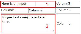 There are different types of input fields in which free text can be written.
For a normal text array, the tag input is used in combination with the attribute type=“text”. This forms a simple text field with one row. (see element 1)
For creating an input field (e.g. for description), an opening <textarea> - and a closing </textarea> - tag are necessary. This can be resized by the user and multiple rows can be written in. (see element 2)
<table id="information" class="anything" border="1">
  <colgroup>
   <col width="100px"/>
   <col width="100px" />
   <col width="100px" />
  </colgroup>
  <tr>
    <td colspan=2>
     <input type="text" id="inputField" name="inputField"></input>
    </td>
    <td>column3</td>
  </tr>
  <tr>
    <td>column1</td>
    <td>column2</td>
    <td>column3</td>
  </tr>
  <tr>
    <td colspan=2>
      <textarea id="textarea" name="textarea"></textarea>
    </td>
    <td>column3</td>
  </tr>
</table>
Formatting in textareas
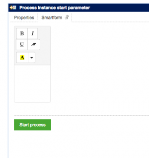
To offer the formatting elements cursive, bold, underlined, blue font and red font in a textarea, the class richtext has to be given.
<textarea class="richtext" id="richtext_variable_name"></textarea>
Datepicker (Calender)
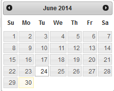
To create a so-called Datepicker to an input field, only the class datepicker must be given to it.
<input type="text" id="datepicker_field" name="datepicker_field" class="datepicker"></input>
The Javascript library JQuery, which is automatically integrated into every smartform, opens now by clicking a field a calender from which a date can be selected, which is then transferred in the input field.
Add stylesheets (CSS)
 The stylesheets are defined between an opening <style> and a closing </style> - tag. The attribute 'type=“text/css”' must be assigned to the opening <style> - tag.
In order to address elements that have a class, the class name must be added with a point in front. Within the following braces it can be defined, how the element should be affected. The information about the style affects all elements that have a class with this name.
To address an element with a specific ID, the ID must be added with a hash mark (#) in front. All the elements that have this ID, now focus their style according to the following definition.
If all elements of a specific type should be addressed, only the tag of the element needs to be added. In this case input.
In the following example, the first column in the second row and the third column in the third row get the class background. The background of these two cells will be colored red as defined in the style area.
Subsequently all input elements are set to a width of 200 pixel.
All elements with the ID firstRow get a blue background.
Finally, now the frame of the table is set on a width of 0 pixel and disappears.
<style type="text/css">
  .background{
    background-color:#FE2E64;
  }
  input{
    width:200px;
  }
  #firstRow{
    background-color:#5882FA;
  }
  #table{
    border-size:0px;
  }
</style>
<table id="table">
  <colgroup>
    <col width="100px"/>
    <col width="100px" />
    <col width="100px" />
  </colgroup>
  <tr id="firstRow">
    <td colspan=2>
       <input type="text" id="inputField" name="inputField"></input>
    </td>
    <td>column3</td>
  </tr>
  <tr>
    <td class="background">column1</td>
    <td>column2</td>
    <td>column3</td>
  </tr>
  <tr>
    <td>column1</td>
    <td>column2</td>
    <td class="background">column3</td>
  </tr>
</table>
Mandatory field at instance start
If an input field has to be already defined as a mandatory field at the instance start, the attribute “required” with the value “true” is necessary.
<input type="text" id"mandatoryField" name="mandatoryField" required="true" />
If a Selectbox changes into a mandatory field and the basic option (eg, “Please select …”) should be defined as not a valid value, the attribute default=“default” of this option must be included.
<select>
   <option dafault="default">Please select</option>
   <option>Value1</option>
   ...
</select>


