Table of Contents
 This page is not fully translated, yet. Please help completing the translation.
(remove this paragraph once the translation is finished)
Adaption of the Dashboard Optic
The look of the Dashboard can be edited in the theme.css file. This file is saved on the server in the Dashboard folder.
Graphical elements, e.g., the logo of a company, are saved in the directory dashboard/img.
Additional features can be added to the CSS instructions at any time.
Login
Background Color, Frames and Positions
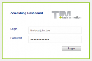
The color of the background and the frame as well as the position of the login window can be adapted via the following entry:
.login-panel {
    background-color: #ffffff;
    border-color: #91c81f;
    border-style: solid;
    height: 200px;
    margin: 220px auto 0;
    padding: 40px;
    width: 360px;
}
Logo
The logo itself as well as its size and position can be adapted via this entry:
.login-panel-panel-for-image {
    background-image: url("img/logo-login.png");
    background-repeat: no-repeat;
    float: right;
    height: 39px;
    width: 151px;
}
Font
The color and the style as well as the size of the font can be adapted using this entry:
.login-panel-panel-for-text {
    color: #00267f;
    float: left;
    font-family: Arial,FreeSans,Helvetica,sans-serif;
    font-size: 14px;
    font-weight: bold;
    height: 50px;
    padding-bottom: 10px;
    width: 204px;
}
Background
The general background
The background can be changed via this entry:
.main-outer {
	width: 100%;
	float: left;
	background-color:#F0F0F0;
	position: absolute;
	top: 0px;
	bottom: 0px;
	overflow-y: scroll;
}
For example, in the following screenshot the attribute of the background color was changed.

Container
The settings for the Dashboard and the individual widgets are stored in the container (the grey-colored area in the example above). The color of the background as well as its position can be adapted using this entry:
.main-panel {
    background-color: #f0f0f0;
    float: left;
    margin-top: 10px;
    width: 100%;
}
The Navigation Bar
The Menu-Item Font
The font color and weight of the items in the menu “Dashboards” and “Layout” as well as “Add Widgets” can be changed in this entry:
.main-menu-bar {
    color: #808080;
    font-weight: bold;
}
The Font and Background Color while Moving the Mouse
The font and the background color while moving the mouse over individual items of the menu can be changed the following way:
.main-menu-bar .gwt-MenuItem-selected {
    background-color: #ffffff;
    color: #808080;
}
The Navigation Bar in General
Settings regarding the color of the frame and the background as well as the position of the entire navigation bar can be adapted here:
.menu-panel {
    background-color: #f0f0f0;
    border-bottom: 1px solid #c0c0c0;
    border-top: 1px solid #c0c0c0;
    float: left;
    left: 190px;
    position: absolute;
    top: 16px;
}
Header
Logo
The logo and its position can be adapted using this entry:
.dashboard-view .header-panel {
    background-image: url("img/default/logo.png");
    background-position: 10px 10px;
    background-repeat: no-repeat;
    float: right;
    height: 65px;
    vertical-align: bottom;
    width: 100%;
}
The Log-out Button
Different settings, for instance the position of the button for logout and the logged-in user as well as the language settings, can be changed here:
.dashboard-view .header-panel .wrapper-in-head {
    float: right;
    padding-right: 16px;
    padding-top: 19px;
}
Widgets
Header
By accessing the following entry the color, the font style, size, and weight used in the header can be changed:
.loom-widget-header {
    color: #ffffff;
    float: left;
    font-family: Arial,FreeSans,Helvetica,sans-serif;
    font-weight: bold;
    height: 25px;
    padding: 6px 0 0 8px;
    width: 57%;
}
The Background and the Height of the Header
The color of the background as well as the height of the header can be changed here:
.loom-widget-header-panel {
    background-color: #808080;
    height: 30px;
}
The Background and Frames of the Widgets
The color of the background and the frames of individual widgets can be adapted the following way:
.loom-widget {
    background-color: #e6e3df;
    border: 1px solid #808080;
    float: left;
    width: 100%;
}
Area Encompassing all Widgets
In addition, the area in which widgets are supposed to be displayed can be edited (i.e., color of the background and the frames as well as position):
.layout-control {
    background-color: #ffffff;
    border: 1px solid #808080;
    border-radius: 10px;
    margin-right: 5px;
}
Widget for Tables
Changing the Row Color Depending on Mouse Position
This selector can be used to set a different color for the rows of a table if the mouse is being moved over the table:
.loom-widget-body tr:hover{
    background: green;
}
Changing the Colors of Selected Rows
The command to change the color of rows while they are being selected can be entered the following way:
.GK40RFKDEE {
    background:red !important;
}
Dashboards Navigation
Selection of a Dashboard
The adaption of the background and font color as well as the position of unselected Dashboards can be made via this entry:
.tab {
    background-color: #f0f0f0;
    color: #808080;
    cursor: pointer;
    margin-left: 10px;
    margin-right: 10px;
    padding: 5px 10px;
}
In turn, the color specification of the background and the font as well as the position of selected Dashboards can be conducted as follows:
.selected-tab {
    background-color: #ffffff;
    border: 1px solid #c0c0c0;
    color: #808080;
    margin-left: 10px;
    margin-right: 10px;
    padding: 5px 10px;
}
The color of the background while moving the mouse over the Dashboard can be determined using this entry:
.tab:hover {
    background-color: #ffffff;
}
Dashboards Settings
Container for Configuration
With this entry the color of the background and the frame as well as the position of the container for configuring different dashboards can be arranged:
.manage-dashboards-list-panel {
    background-color: #ffffff;
    border: 1px solid #808080;
    border-radius: 10px;
    margin-right: 5px;
    overflow: hidden;
    padding: 10px;
    position: relative;
}
My Dashboard
Via this entry the formatting of the lettering “My Dashboards” can be adapted:
.config-panel-heading {
    color: #808080;
    font-family: Arial Unicode MS,Arial,sans-serif;
    font-size: 25px;
    padding-bottom: 20px;
}


