
This is an old revision of the document!
Table of Contents
 This page is not fully translated, yet. Please help completing the translation.
(remove this paragraph once the translation is finished)
TIM Smartform Suite - DRAFT
1. Introduction and differentiation of the TIM Smartform Suite from HTML smartforms
- Configuration instead of programming
- Quick smartform design. Validation, layout and structure
- Ausbaustufen:
- Every created configuration can be opened in every version but can only be altered if the used version includes the functionalities.
2. Access to the Tim smartform suite
2.1 Systemrollen für den Zugang zur TSS
A user has to have the following TODO:roles Systemrollento use the corresponding version of the TIM smartform suite:
- „smartform-designer“ to gain excess to TODO TIM Smartform Designer
- „smartform-architect“ to gain excess to TODO TIM Smartform Architect
- „smartform-expert“ to gain excess to TODOTIM Smartform Expert
2.2 Excess via repository
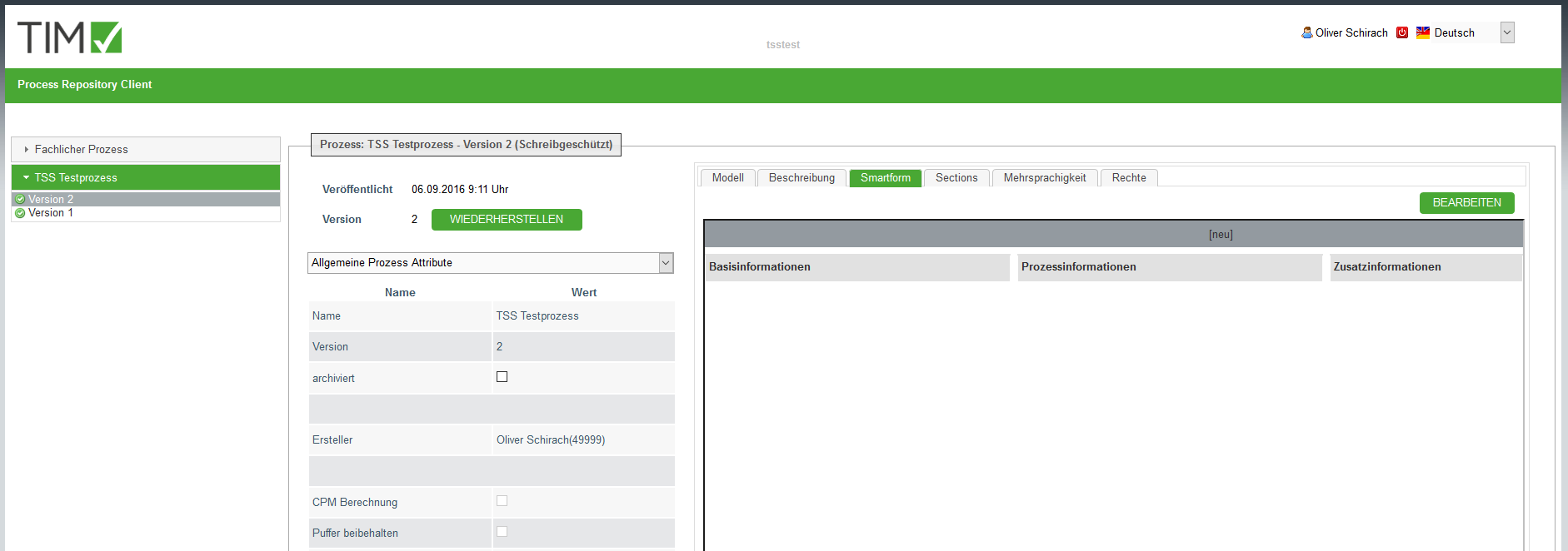
The acces to the configurator of the TSS happens via TODO TIM Repository. In the Tab “Smartform” you can find an “EDIT”-Button. The configurator will be opened in a seperate tab upon clicking it.
2.3 Systemrolle für die Verwaltung von TSS Ressourcen
Every data-artifact wich is used for the creation of a smartform is saved in a central database. An UI is integrated for the management of the artifacts was integrated in the admin client. A user needs the following role to manage the tss-recources (z.B- confiuratins, CSV-documents, CSS-documents etc. TODOVerwaltung von TSS-Resourcen in his client or super- client:
- „resource-manager“ (If a user is a “resource-manager he doesn't necessarily need the role “admin”)
2.3.1 Global ressources in the super- client
After the installation/update of the TSS the basic configurations (documenttype CONFIG-document) for the applications CMD and CFG have to be uploaded in the super- client.
- The configurations dor ACM, TIM-portal and TIM-smartform are included in the product, but can be individualized.
- With the document-type CSS you can provide a CSS-document in order to implement your corporate identity (Colors, accent etc.) globally for the configurator(CFG) and the representation of the smartform (TIM Smartform)
- The document will be automatically renamed into css.css upon uploading.
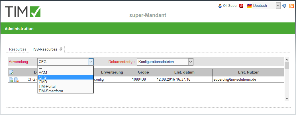
- Wth the document-type TODO?Logo-Dateien? you can upload a PNG-Document with your corporate logo, wich will be automatically renamed into logo.png upon uploading and will be displayed in the top-left corner of the configurator.
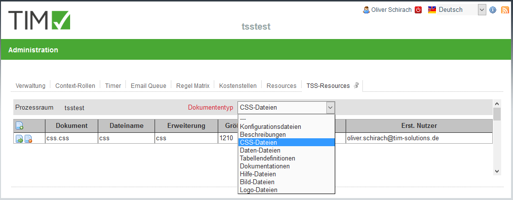
2.3.2 client-specific resources
It is possible to have artifacts in your client, wich are only available and effective in your client.
- For example a CSS-document wich implements your corporate CI
- Documents with the types .csv, .txt, .xls, .png etc for integration in smartforms
3. TIM Smartform Designer
3.1 Target group & project-scope
- Proffesional users who want to creaete a simple smartform
- Predefined templates
- Intentionally limited choice of possible data-types.
- Creation and arrangement of attributes
- Only simple Smartform, which means without tab-pages, tables or accordions etc. Nur einfache Smartforms, d.h. ohne Tabpages, Tabellen, Accordions, etc.
- For more complex smartforms you have to use the other versions: TODO TIM Smartform Architect and TIM Smartform Expert.
3.2 Explanation of the UI and function - target group professional users!
3.2.1 UI and operationg philosophy
The smartform designer focuses on the smartform.
- It is based on a template and provides the opportunity to arrange atributes per drag and drop.
- With this function you can design you smartform compatible with your process.
- The TSS enables you to use a uniform operating philosophy in your smartforms.
- Because of the uniform structures of the arrangements of attribute, validations, and mandatory fields and editability etc. your end-users will quickly understand all your processes.
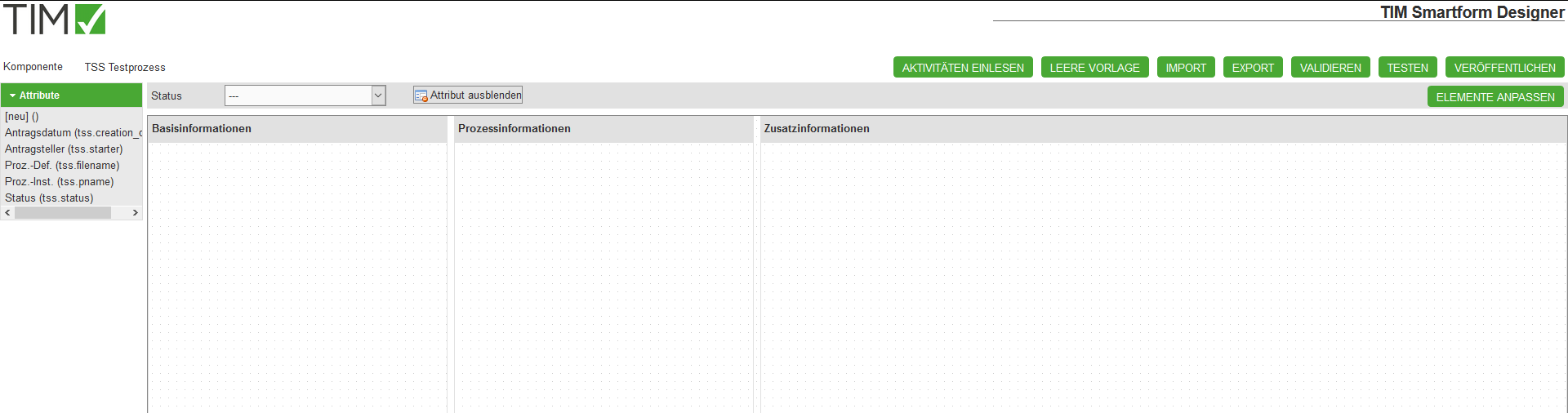
- With the button Import activities you can import the activities of your modeled process
- With the Import and Export button you can import configurations or export them as a backup or for further usage in other processes.
- With the Validate button you can validate your configuration.
- With the Test button you can test your smartform from user-perspective TODO:(For further details 3.2.3 Testmodus)
- With the button Deploy you can safe your configurations. Everything you change must be safed by pressing the Deploy button, afterwards it can be seen in the ToDo client.
- If you refresh your browser without pressing the Deploy button your changes will be lost.
- Before/after doing big changes it is strongly recommended to safe your changes by pressing Deploy
- The changes on your smartform will be effective for the value ”—“ in the status-dropdown. In symbolizes the basic configuartion.
- In the chapter TODO 3.2.4 Statusabhängige Konfiguration - Aktivitäten einlesen it will be explained, how you can individualize your smartform for specific activities in the process.
- Attributes can be placed in any order, moved to another element or be hidden for a specific status via drag and drop
- For further details: TODO3.2.2 Attribute
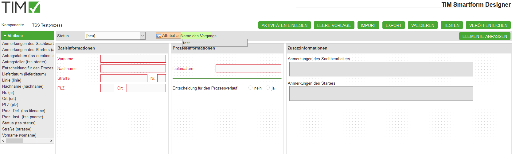
3.2.2 Attribute
In the smartform Designer you can create attributes to gather and display process information.
- A new attribute can be created by drag&dropping the [new] () tag into the smartfom.
- This is only possible if the status-dropdown is set to ”—“. (For further details to status-specified configurations see also TODOStatusabhängige Konfiguration - Aktivitäten einlesen)
- A new attribute will be safed as a TIM-process-variable.
- For futher usage (e.g. in Word templates or Emails etc.) the attributes can be found in the process with ${name_of_the_attribute}
- Eine spätere Auswertbarkeit im Dashboard zur KVP ist gegeben
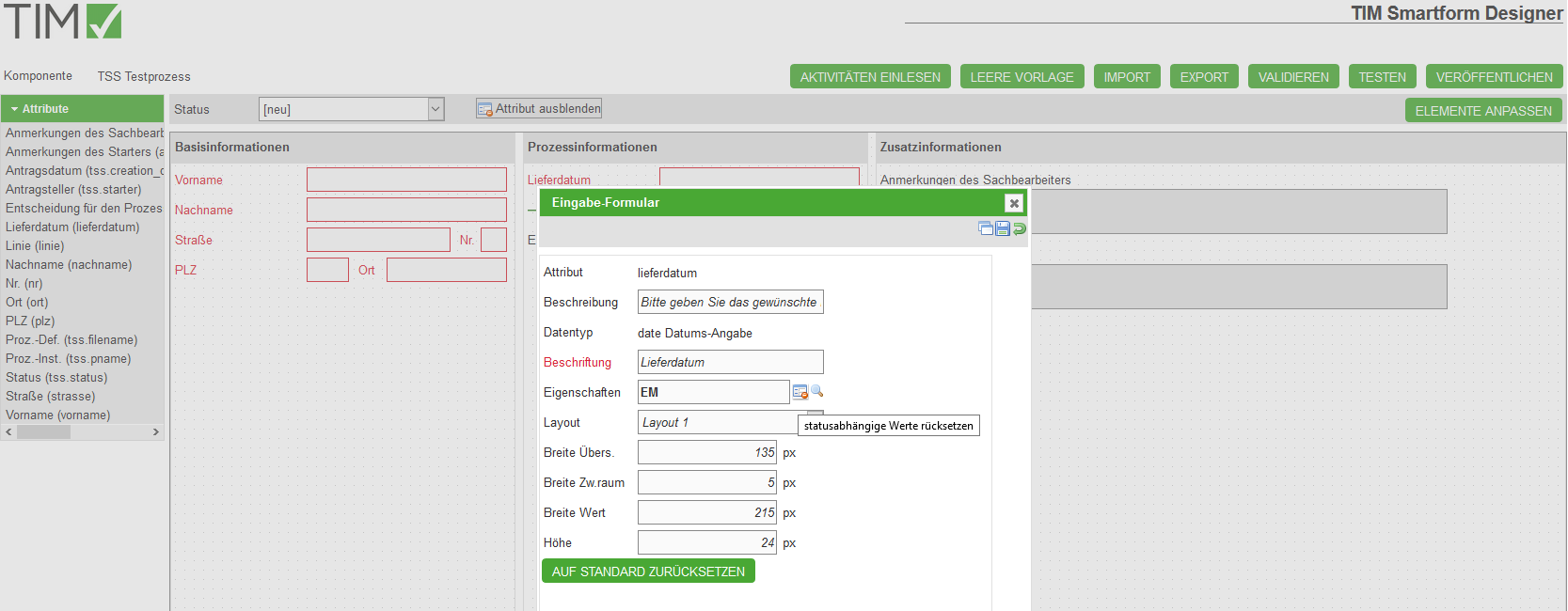
- If a new attribute is dragged into the smartform or if an existing attribute is clicked, a pop-up will appear. There you can change the properties of the attribute:
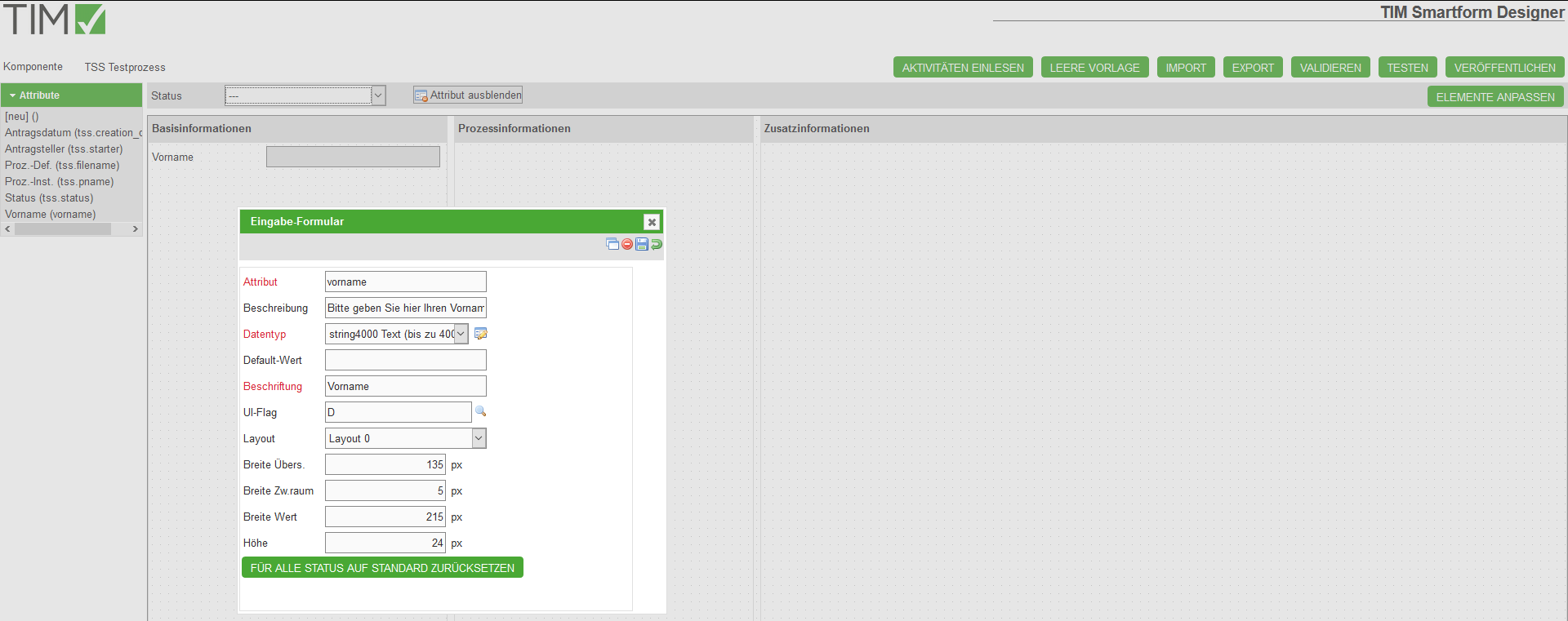
| Field | Description |
|---|---|
| Attribute | Identifier of the attribute. Can be referenced with ${…} in emails. (“status” and “name” mustn't be used as attribute-identifier) |
| Decription | Appears as a tooltip as soon as the user places his mouse on the attribute |
| Data-Type | You can select a data-type or create an individual validation (see also TODODatentypen) |
| Caption | Will be displayed as text in the left side of the attribute |
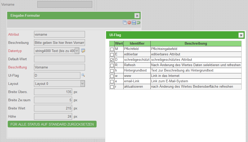
| UI-Flag | Definition of the editability of the attribute |
| Layout | Selection of a layout for the display of the attribute. (see also TODODatentypen) |
| Width label | Width of the space where the desctription will appear |
| Width space | Distance between description and attribute |
| Width value | Width of the attribute |
| Height | Height of the attribute. Every height that is bigger than 24px will be displayed with the layout-option “big” (see also TODODatentypen) |
| Button | Description |
|---|---|
| Reset all status to default | This button will appear, if the status-dropdown is set to ”—“. It will reset every status-specified versions of the attribute. |
| Reset actual status to default | This button will appear if the status-dropdown is set to something different then ”—“. By pressing it you will reset the configurations of this attribute for the selected status. |
| “Reset a selected attribute-property”-Icon | Every attribute-property that differs from the standart-configuration will be desplayed in a bold text. Moreover a button will appear, that will reset the property upon pushing |
| Copy-Icon | Uses the attribute for the creation of a new one. The properties Attribute and Label will be reseted. |
| Delete-Icon | Deletes the attribute. This icon only appears while the status-dropdown is set to ”—“. If you want to hide an attribute, drag&drop it onto the Hide attribute area near the status-dropdown. The attribute will be hidden for the selected status but is still available in the attribute-list in the left side of the screen |
| Save-Icon | Saves the changes/new attribute |
| Reset-Icon | Sets all attributes to the last saved value |
Reference: For further details see also TODOStatusabhängige Konfiguration - Aktivitäten einlesen
- Every new or changed attribute must be safed by clicking on the save-icon.
- Afterwards the pop-up can be closed and the new/changed attribute will appear on the smartform.
- Every attribute can be moved inside one element or to another per drag&drop.
- If you want to hide an attribute, drag&drop it onto the Hide attribute area near the status-dropdown. The attribute will be hidden for the selected status. See also the screenshots in TODOStatusabhängige Konfiguration - Aktivitäten einlesen
- The attribute will be still saved in the coniguration, but invisible for the selected status.
The Ui-Flags define the editability and can be found in the attribute Pop-up. You can either select them fromm a list wich pops up after ckicking on the magnifying glass or write them in the text field:
3.2.3 Testmodus
After clicking on the Test-button the smartform will appear like it would look in the current status. Now you can check if the attributes are editable and visible like they should be.
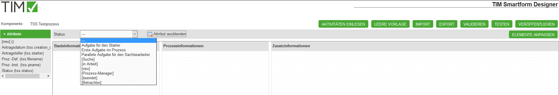
3.2.4 Statusabhängige Konfiguration - Aktivitäten einlesen
After you have constructed a smartform for the ”—“-status you can now define special process-cases. You need to click the IMPORT ACTIVITIES -button.The status-dropdown will be filled with your process activities.
- Now you can select an activity or a standart status [neu, Suche, in Arbeit, Prozess-Manager, beendet, Betrachter] and change your smartform as you wish:
- Insert attributes
- Relocate or hide attributes
- Modify attribute properties by clicking on an attribute. See also 3.2.2 Attribute
* You can for example make a certain field a mandatory field for an activity.
Attention: If you want to create an attribute just for one status, you have to create it for the status ”—“ first, then drag it onto Hide attribute. Afterwards you have to select the status you want this specific attribute to be visible in and then drag&drop the attribute from the attribute list on the left side of the screen.
- in the attribute pop-up the status-specified configurations will be displayed bold. Configurations that are inherited from the ”—“-status will be displayedcursive
- Specification of the configurations of the smartform that was created above for the status [neu], which is active while the process is started.
3.2.5 Datentypen
In the attributee pop-up yoiu can find a list of predefined data-types:
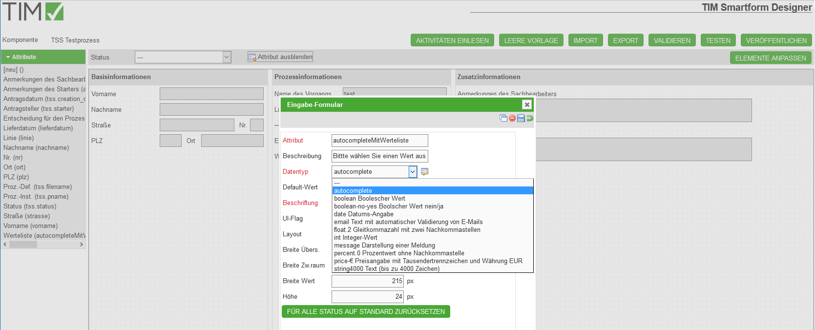
- While using the Smartform designer you will be limited to the following list of data-types.
| Data-type | Description | Example for usage |
|---|---|---|
| boolean | Booleschean Value | Can be used as a check box |
| decision-no-yes | Boolscher Value Yes/No | As a radio box with the options Yes/No |
| date | Date | Can be used as a textbox with a date-picker |
| Text box that automatically validates Email-adresses | As a textbox | |
| float.2 | A number that is rounded to two decimal places | A text-field, wich will try to parse any input to a number with two decimal places and won't accept any other input |
| int | A whole number | A text-field that will try to parse any input to a whole number and won't accept any other input |
| message | Displays a message | To display a legend |
| percent.0 | Percentage without decimal places | As a text field with the unit % |
| price-€ | Pricing with thousends seperator and EUR as currency | A textfield with the unit EUR and validation of numbers with up tp two decimal places |
| string4000 | A character string up to 4000 characters | As a textfield or box |
- If you click the symbol on the right side of the datatype-dropdown list in the attribute-popup you can look through different layouts
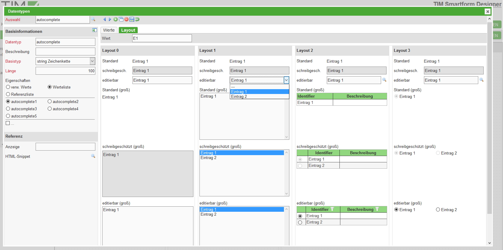
- You can also create an own data-type in the Data-type-popup by clicking the green PLUS-Icon
- This data-types are based on existing data-types
- By creating length-limitations or input-masks you can create a validation. This can be used to create a field that validates input to fit a certain structure, for example an accounting area XX_098_XX.
- For further details to the creation of new data-types see TODO 6.4 Modul Datentypen
- Coplex data-tyoes, like CSV-Lists for autocomletes or Dropdowns can be created in the TODO TIM Smartform Architect
- Created data-types will appear in the data-type dropdown-list in the attribute pop-up and can be also used in the designer.
Some comlex data-types can be created in the Designer:
- Radio-Buttons with more than two options:
You have to create a new data-type, like descriped above: You will have to select the basic-type “String” and “Value List” as Property. The “Length” defines the maximum numbver of characters that can be used in the Label of each button. After saving (click floppy disk) two tabs will appear: “Values” and “Layout”. In the tab “Values” you can create the radio-buttons. The property “Value” will define the value which the radio button will return upon being selected. Now you have to save the attribute and close the pop-up. In the remaining pop-up you have to select “Layout 3” and set the “Height” to >= 25 pixel.
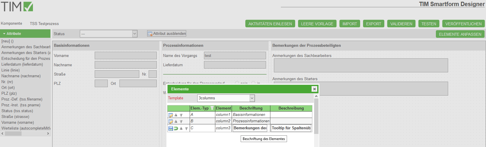
3.2.6 Templates
The basis of a smartform is the template. Upon creating a new smartform, the 3columns-template will be selected. If you need a special template you have to create it by using the Smartform-Architect or -Expert. A user with the right smartform-architect or smartform-expert can create a unique template. Attention: The Smartform Architect is for professional users. Deswegen ist eine Pflege von komplexen Layoutelementen, wie z.B. Tabs und Platzhalter für die Darstellung von Tabellen, nicht im Designer pflegbar
- Via ELEMENTE ANPASSEN können Sie zudem die Überschriften der Template-Elemente anpassen:
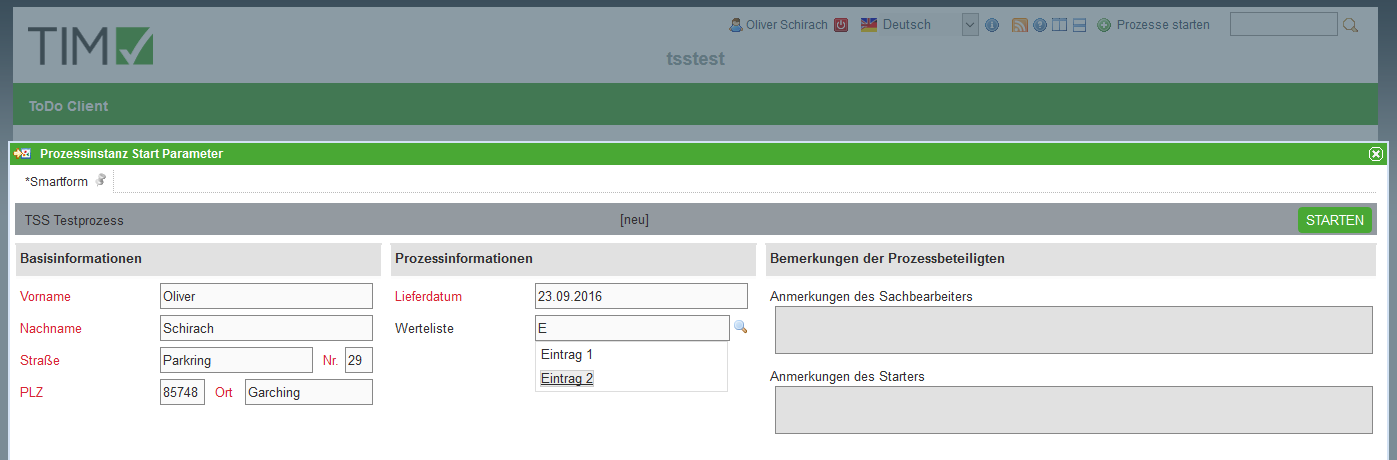
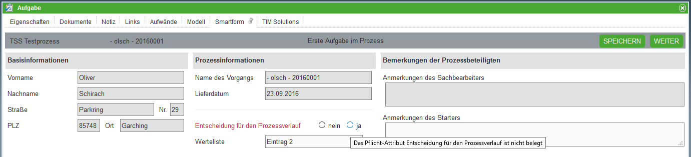
3.2.7 Ergebnis im ToDo Client
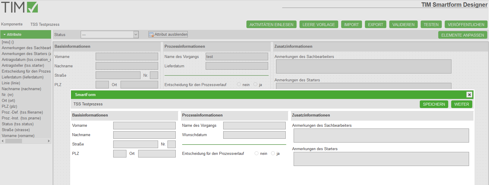
Der folgende Screenshot zeigt das konfigurierte Smartform einmal für den Prozessstart und einmal für die erste Aufgabe. Sie können sehen, dass teilweise Attribute ausgeblendet, oder rot als Pflichtfelder hervorgehoben sind:
- Smartform für den Start eines Vorgangs “TSS Testprozess”:
- Smartform für die Erledigung der ersten Aufgabe “Erste Aufgabe im Prozess” Vorgangs “TSS Testprozess”:
3.2.8 Config zum Selbertesten
Die Konfiguration, anhand der die Screenshots erstellt wurden, können Sie hier einsehen und für Ihre Tests verwenden: Beispielkonfiguration
4. TIM Smartform Architect
4.1 Zielgruppe & Projektscope
- IT Berater
- Erstellung komplexer Smartforms mit Datenstrukturen, Tabpages, etc.
- Integration von strukturierten Daten aus csv, txt, xls oder Datenbanktabellen
- Erstellung von Übersetzungen für mehrsprachige Smartforms in DE und EN
- Erstellung von Datentypen, Templates und Meldungen für einen Prozess
- Einfacher Zugang zu Groovy für showInterface zum modifizieren der Benutzeroberfläche für Sonderkonstellationen oder Feldabhängigkeiten
- ALLES, was für einen Prozess definiert wird, d.h. Templates, Datentypen, etc. ist nur innerhalb dieses Prozesses gültig und existent!
4.2 Erklärung der Oberfläche und Funktionen
- Überblick: Menü; Sidebar; WYSIWYG
- Details siehe 6. Module des TIM Smartform Architect und Expert
5. TIM Smartform Expert
5.1 Zielgruppe & Projektscope
- IT Berater und Entwickler
- Tiefe Systemintegration
- Komplexe Konfigurationsmöglichkeiten
- Groovy extended. Auch zur Verwendung im Prozess via CBAGenericActionHandler möglich
- ALLES, was für einen Prozess definiert wird, d.h. Templates, Datentypen, etc. ist nur innerhalb dieses Prozesses gültig und existent!
5.2 Erklärung der Oberfläche und Funktionen
- Überblick: Menü; Sidebar; WYSIWYG
- Details siehe 6. Module des TIM Smartform Architect und Expert
6. Module des TIM Smartform Architect und Expert
6.1 Modul Bedienoberfläche
- Eigenes Template erstellen:
Sie brauchen Architect- oder Expertrechte. Klicken Sie oben rechts auf den Reiter “Templates”, anschließend auf das grüne “PLUS-Icon”. Bennen Sie ihr neues Template in dem Feld “Template” und speichern Sie alles (Diskette). Anschließend gehen Sie auf den Reiter Elemente und klicken auf das grüne PLUS-Icon am rechten Bildschirmrand. Bennen Sie ihr Element. (Folgendes ist nicht der einzig richtige Weg sondern nur ein Vorschlag wie man ein blankes Template in passender Größe designen kann). Wählen Sie als Position 1 aus, falls Sie noch keine anderen Elemente eingefügt haben, geben Sie als Element-Typ “A-Element” und als “UIE” “uie-details Formular-Element” an. In dem Abschnitt “Positionierung” können Sie die gewünschte Größe sowie den Abstand zu anderen Elementen in Pixeln angeben. Anschließend drücken Sie auf Speichern (Diskette) und auf “Veröffentlichen”.
6.2 Modul Templates
6.3 Modul Tabellen
- dau- immer entsprechend des Dateityps, oder Datenbankzugriff
- Bei Ablage als Prozessvariable (BL-Flag P) immer dau-tim verwenden. Achtung: Max. 4000 Zeichen in einer Prozessvariable erlaubt. Dies schließt Steuerzeichen der Tabelle mit ein. Bitte nur zum fixen Testen verwenden
6.4 Modul Datentypen
Auflistung aller Basistypen und Details dazu
Reguläre Ausdrücke
- Stellen Pattern erlaubter Zeichenketten dar.
- Ist im Feld für den regulären Ausdruck ein Pattern eingegeben, ist der Attributwert nur erlaubt, wenn er dem Pattern entspricht.
- Syntax von regulären Ausdrücken ist nicht einfach – bitte Literatur verwenden, z.B. http://www.regular-expressions.info/quickstart.html.
Masken
- Geben dem Nutzer definierte Pattern zur Eingabe vor und lehnen Falscheingaben ab:
- 0 .. Vorzeichen und Ziffern
- 9 .. nur Ziffern
- a .. Buchstaben (A-Z,a-z) sowie ‘-’ und ‘_’
- z .. nur Buchstaben (A-Z,a-z)
- * .. Buchstaben (A-Z,a-z) und Ziffern sowie ‘-’ und ‘_
6.5 Modul Meldungen
6.6 Modul Übersetzung
6.7 Modul funktionale Struktur
6.8 Verwaltung von TSS-Resourcen
7. praktische Tipps für die gängigsten Smartformanforderungen
7.1 Attribute in Taskliste darstellen
- Attribute, die in der Taskliste angezeigt werden sollen, sind sog. Indexfelder
- Es gibt 10 Felder, die mit beliebigen Attributen belegt werden können
- Modul Tabellen - tim_process auswählen - Tab Attribute - Attribut auswählen - rechts in der Sidebar unter Geschäftslogik das BL-Flag auf 1 oder 2 … oder 0 setzen - speichern - Veröffentlichen - Echten Prozess zum Testen starten
- Die Spaltenüberschriften können mittels dem folgenden Eintrag in der custom.js für jeden Mandanten angepasst werden:
- gadget.languages.de.standard_smartformindex1= 'Überschrift für Index 1 in DE';
- gadget.languages.en.standard_smartformindex2= 'Überschrift für Index 1 in EN';
7.2 Besondere Eigenschaften von Attributen
- Zusätzliche Flags zu “E” oder “D” für:
- Mail (e): Es wird automatisch rechts neben dem Eingabefeld ein kleines Icon gerendert. Wenn der Nutzer auf das Icon klickt, dann öffnet sich das Systemstandardprogramm für den Versand einer Mail. Die Empfängeradresse wird dabei vorbelegt
- HTML-Link (w): Es wird automatisch rechts neben dem Eingabefeld ein kleines Icon gerendert. Wenn der Nutzer auf das Icon klickt, dann öffnet sich der Systemstandardbrowser und die eingegebene Webseite wird geladen.
- Zusätzliche Flags zu “E”:
- Placeholder (h): Der eingegebene Text aus dem Feld Beschreibung wird nicht nur als Tooltip verwendet, sondern auch als Hintergrundtext in editierbaren einzeiligen Textfeldern. Sobald der Nutzer etwas eintippt, verschwindet der Hintergrundtext
- refresh (r ): Dies führt dazu, dass nach Eingabe durch einen Nutzer in das Feld, das Smartform neu geladen wird. Alle Daten bleiben erhalten. Dadurch wird aber die Groovy Methode showInterface erneut ausgeführt. Dort abgelegte Funktionen können nun basierend auf der Eingabe des Nutzers z.B. Attribute ein-/ ausblenden oder Pflichtfeldbedingungen individualisieren
- Werden diese beiden Flags in Kombination mit “D” ond/oder ohne “E” genutzt, dann haben sie in dem Moment keine Wirkung
- Umbruch Labelbreite zu Feldbreite:
- Per default wird ein Attribut immer wie folgt gerendert: Label + Zwischenabstand + Eingabefeld
- Wenn nun das Eingabefeld einmal unter dem Label erscheinen soll, dann muss die Breite des Labels, d.h. Breite Übers., einfach breiter eingestellt werden. Wenn nun Breite Übers. + Breite Zw.raum + Breite Wert > Breite des Elements, in dem das Attribut platziert wird, dann bricht das Eingabefeld automatisch nach unten um
7.3 Einbinden einer csv-Datei für ein Autocomplete-/Dropdownfeld
- Zuerst muss im Modul Tabellen eine Tabelle angelegt werden, die genau so heißt, wie die vorliegende csv, txt oder xls
- Die Tabelle bekommt die entsprechend ihrer Endung passende DAU zugeordnet.
- Die BLU muss immer auf blu-basic gesetzt werden
- Nun müssen in dieser Tabelle alle Spalten, die in der zugrundeliegenden Datei existieren, als Attribute angelegt werden
- Dies ist analog zu den Attributen im Smartform auszufüllen
- Wichtig: DA-Flag immer auf “SIU” setzen
- Indizes: Hier geben Sie an, welche Spalten zur eindeutigen Referenz (= Index 1) eines Datensatzes zusammengezogen werden müssen
- Ref.-Typ:
- Hier entscheiden Sie, welches Attribut mit “D” automatisch als Bezeichnung, z.B. später in einer Dropdown verwendet wird
- Hier entscheiden Sie, welches Attribut mit “I” automatisch als fachlicher Kurzidentifier verwendet wird
- Hier entscheiden Sie, welches Attribut mit “V” automatisch verwendet wird, wenn ein ausgewählter Eintrag gespeichert wird
- Details siehe unten (Exemplarisches Ergebnis eines Dropdowneintrags im HTML: <option value=“Attribut mit V”>“Attribut mit I” “Attribut mit D”</option>)
- Nun muss die Datei via Tab Ressources im Admin Client hochgeladen werden. Hierbei ist der Datentyp Datendatei auszuwählen
- Nach dem Upload bitte den Button Cache löschen klicken, damit die neueste hochgeladene Version verwendet wird
- Datentyp für Dropdown
- Damit die Tabelle nun als Grundlage für eine Dropdown oder ein Autocompletefeld verwendet werden kann, muss hierfür ein datentyp angelegt werden
- Basistyp: = Datentyp der Spalte aus der CSV, die als eindeutige Referenz dient
- Eigenschaften: Referenzliste
- Tabelle: vorher angelegte Tabelle
- Attribut: Das Attribut aus der Tabelle, das in der DB gespeichert werden soll. Es muss eindeutig sein. Entspricht dem Attribut mit dem “V”
- Filter: optional - hier kann mit der Syntax ATTRIBUT= die Ergebnismenge der Tabelle auf ein Attribut eingeschränkt werden. Mittels ATTRIBUT={ATTRIBUT_IN_TIM_PROCESS} kann auch auf den Inhalt eines anderen Attributs gefiltert werden, um somit eine Filterung zu ermöglichen, die vom Inhalt eines anderen Attributs abhängig ist. WICHTIG: Das Attribut, wonach gefiltert werden soll, muss das Flag “r” haben, damit bei einem Wechsel des Wertes auch die Tabelle mit dem neuen Filter geladen wird
- Anzeige:
- leer lassen, dann zieht der Default, bestehend aus I und D
- oder mit {Attribut} die Attribute auswählen, die angezeigt werden sollen. z.B.: {nachname}, {vorname} ergibt: “Schirach, Oliver”
- Alternativ kann die Tabelle auch als Grid eingebunden werden, um Datensätze tabellarisch darzustellen oder bearbeitbar zu machen
7.4 Erstellung von Tabpages
- Im Smartform muss ein Element mit der uie-tabpages-interfaces eingebunden werden.
- Soll das erste enthaltene Tab direkt geladen werden, dann muss unter Eigenschaften das Flag “t” ausgewählt werden
- Nun muss für jedes zu platzierende Tab ein Template erstellt werden
- Achtung: Bitte vermeiden Sie eine Überschneidung der verwendeten Elementbuchstaben, da sonst beim drag&drop die platzierten Attribute in allen Tabs auftauchen, in denen der selbe Buchstabe existiert
- Sollte eine Überschneidung von Buchstaben unumgänglich sein, so dürfen die Attribute, die in den betroffenen Buchstaben nur in einem Tab auftauchen, nicht per drag&drop platziert werden
- Die Attribute müssten dann via Bedienoberflächen - Attribute in der tabellarischen Ansicht den jeweiligen Buchstaben zugeordnet werden. Achten Sie hierbei darauf, dass Sie sich im richtigen Tab befinden. Wenn in der Tabelle ein Elementbuchstabe eingegeben wird, dann erscheint das Attribut exakt nur in dem gewünschten Tab.
- Zur Kombination des Tabs mit dem Element im Smartform, müss aus dem Accordion in Bedienoberfläche - Editor der Eintrag ”[neu] ()“ aus dem Untermenü “Inhalte” auf das Element mit der uie-tabpages-interfaces gezogen werden
- Hierbei erscheint links eine leere Sidebar, in der das einzufügende Tab konfiguriert wird:
- Bedienoberfläche: technischer Name für das Tab
- Beschriftung: im Smartform verwendeter Bezeichner für das Tab
- übergeordnet: Smartform
- Template: Das zu verwendende Template für das Tab auswählen
- Menü / Inhalt: Das Element mit der uie-tabpages-interfaces auswählen
- UIU: Wenn der Tab auch einfach nur Attribute enthält, die als Prozessvariablen in tim_process abgebildet werden, dann: uiu-selection
- Wenn das Tab auf eine Tabelle zeigt, die mit dem Prozess in Verbindung steht, dann uiu-details
- Eigenschaften: E, damit der Tab generell editierbar ist
- zusätzlich n und a, wenn der Tab auf eine Tabelle zeigt, di emit dem Prozess in Verbindung steht und die darin befindlichen Attribute unmittelbar im Tab angeordnet werden. Sobald eine grid in dem Tab verwendet wird, so sind n und a nicht zu verwenden
- Icons: keine notwendig. Sie kommen zum Tragen wenn über diesen Weg ein grid zur tabellarischen Ansicht/ Bearbeitung von Datensätzen eingebunden wird
- Tabelle: tim_process, wenn einfach nur Prozessvariablen dargestellt werden sollen, oder eine andere fachliche Tabelle, wie gewünscht
- Filter: Einschränkung einer fachlichen Tabelle auf gewisse Einträge. So könnten z.B. aus einer Stammdatentabelle Informationen angezeigt werden, die entsprechend nach einem oder mehreren Attributen gefiltert sind
7.5 Integration einer fachlichen Tabelle als Grid
- Achtung: verwendetes Template grid-Template unter Bedienoberfläche - Elemente - G - auf uie-grid-edit umstellen, sonst tauchen die Icons nicht auf
7.6 Erstellung eines Accordions
- Subelemente
7.7 Erstellung eines Groovy Codes, der beim Laden des Smartforms gezogen werden soll
- Im Modul Bedienoberfläche gibt es für jede Bedienoberfläche links in der Sidebar den Button “showInterface”
- Dort kann Groovy Code hinterlegt werden, der im Moment des Seitenaufbaus ausgeführt wird
- Mit dem Flag r kann das Neuladen des Smartforms nach Eingabe eines Wertes in ein Feld aktiviert werden
- Dadurch wird das Smartform neu geladen und showInterface erneut ausgeführt
- Ebenso werden dynamische Filter in Datentypen oder Tabellen, die auf andere Attribute zugreifen, neu ausgeführt
- Eingegebene Daten bleiben bei diesem Neuladen erhalten
- Beispiele:
- Auslesen der Benutzersprache und setzen in das Attribut “sprache”:
      def locale = FRAME.getProperty("locale_id").toUpperCase();
      if (locale != null && locale.length() > 1 && locale.substring(0,2) != "DE") {
         DATA_ROW.setValue("mm_sprache","EN");
      }
- Setzen des UI-Flags für ein Attribut:
      ICbaRow attribut_xxxx = FRAME.searchRow("dd_intattr", "interf_recid=" + CONFIG_ROW.getRecid() + "&attr_id=TECHNISCHER_ATTRIBUTNAME");
      attribut_xxxx.setValue("ui_flag", "D");
- Lesen eines Wertes für ein Attribut:
String wert_des_attributs_im_moment_des_seitenaufbaus = DATA_ROW.getValue("TECHNISCHER_ATTRIBUTNAME");
- Setzen eines Wertes für ein Attribut:
DATA_ROW.setValue("TECHNISCHER_ATTRIBUTNAME", "neuer_Wert_für_das_Attribut");
7.8 Konfiguration von statusabhängigen Attributeigenschaften
- Zurücksetzen einzelner Attributvarianten auf Standard
- „Für alle Status auf Standard zurücksetzen“ bzw. „Auf Standard zurücksetzen“ Schaltflächen
- Statusübersicht. Kopieren, Löschen, * Schritt, der entfallen ist *
8. Installation
- siehe Installation
9. Altes CBA Wiki